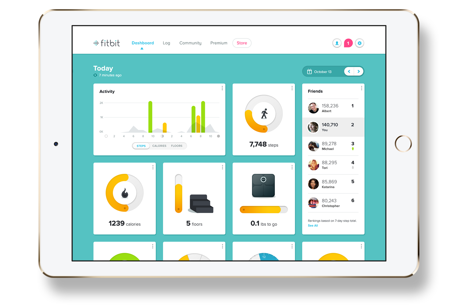
Fitbit Dashboard Redesign
Fitbit was in the middle of transforming it's dashboard from a simple list to the moveable cards it has today. They wanted Odopod’s help figuring out what the progress indicators, icons, graphs, and lists would look like – making sure to differentiate from it’s competitors.
My husband, boyfriend at the time, bought me a Fitbit Ultra in 2012 and I was obsessed from day one. With the help of Fitbit I lost 30lbs, took on the 50 mile Kennedy walk (twice), and continue to walk to and from work every day. Needless to say I was ecstatic to work on the redesign of Fitbit’s dashboard.
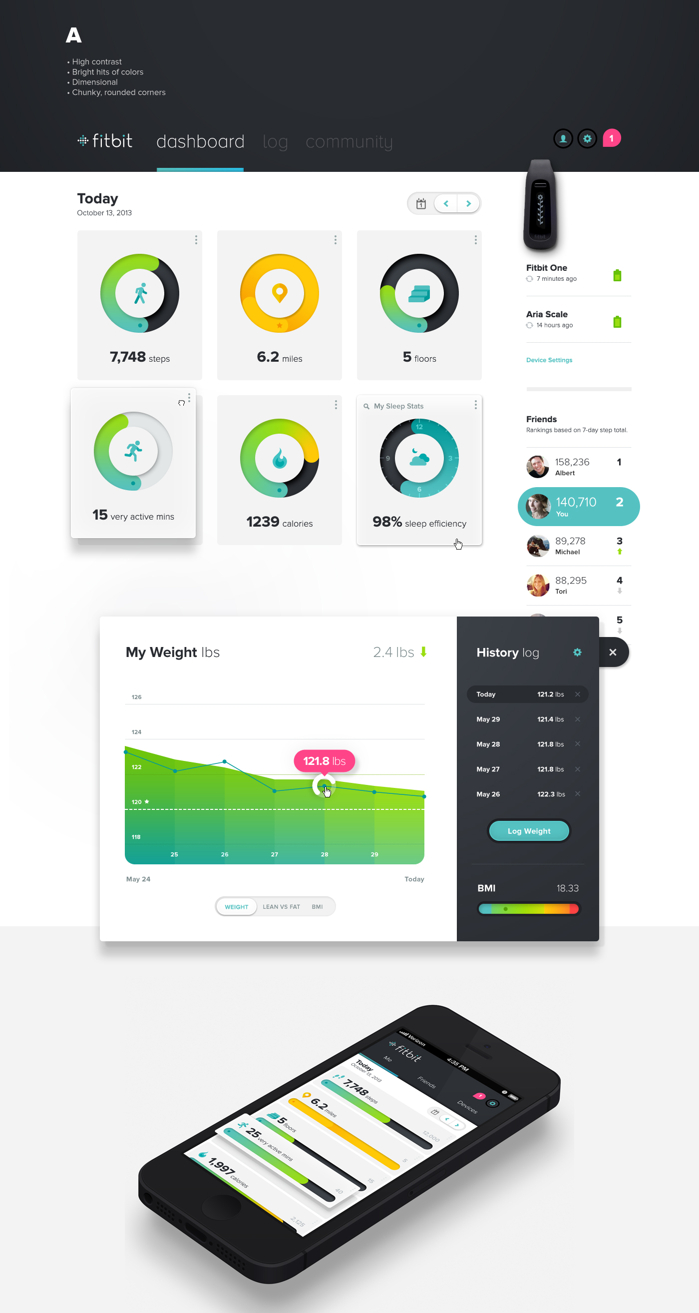
We started with two rounds of themeboards. They chose a friendly aesthetic: bright hits of color on a high contrast background, dimensional interactive elements, duo-tone iconography, and chunky rounded corners.
From there we continued to adjust colors and iconography. Fitbit was particularly concerned with what the progress indicators would look like at different times of the day – making sure that the color was indicative of the user's progress.


At the end of our engagement iOS 7 came out and flat design was immediately preferred over the tactile interfaces. Fitbit just moved forward with the elements that were flat – some of which still exist in the design today.
